Graceful Degradation vs. Progressive Enhancement
Browsers or Content #
I’ll admit it: I came from a world and a time where some of my first experiences designing for the web were soured by having to tweak my oh-so-perfect layout to “dumb it down” for older browsers. I’d get so frustrated that those using said browsers wouldn’t get a chance to behold my amazing layout skillz and lament the various made-up reasons why everyone couldn’t just use insert latest browser magic here.
So what is the solution to this seemingly intuitive but ultimately mistaken approach to building sites?
Content-first #
Our sites, designs, apps, whatever, are nothing if not content-based, or content-driven. These are sites that move, change, or display content. This is the fundamental reason for the site’s existence and should be at the core of how a site is built.
Solving the dilemma of broswer-issues doesn’t start with worrying about browsers. It starts with a bit of shift in how we think about how things are structured.
Practical Matters #
I won’t make this into a long-winded discussion about content strategy so let’s dive in to how this is strategy is actually structured.
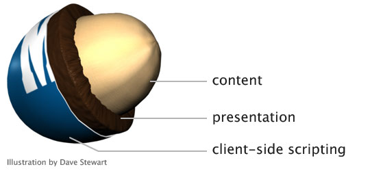
The first step in the process is getting your content in place as a part of a semantic markup document (HTML5/XHMTL). If nothing else, those without access or ability to render/use presentational, visual, or interactive technologies can easily access your content.
The second step is to apply visual and presentation rules to that content as a nice coat of paint to engage your audience using technologies like CSS3.
Finally, you apply an interaction layer in the form of JavaScript (or other scripting language, but usually JS). This allows those with access to all of the layers presented here to manipulate your rich content.
Bases Covered #
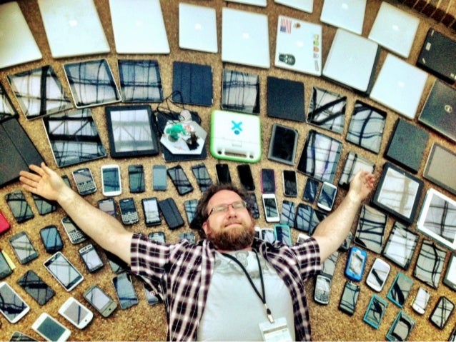
This approach of having separate concerns layered to enhance content allows for a lot of flexibility with regards to the user. It is impossible to guess how one might need to access your content, whether its from a screen-reader, a mobile device, and older computer, or even a computer with strict technical requirements due to its operating environment.
Coupled with best practices regarding media types, forms, and other issues with CSS and responsible uses of JavaScript, Progressive Enhancement offers an incredibly robust way to approch mobile first design as well. This guy gets it:
I actually gave up on web design for a while because of some of these “browser issues”, and went back to the relative serenity of the print world (if serenity means getting in arguments about ink density or registration issues with press guys). My recent re-exposure to working on the web is still fraught with some obstacles and frustrations, but one thing is for sure: things are looking up in a big way.